
Top jewelry brands like Tiffany & Co. and Cartier treat jewelry packaging colors as a branding tool, not decoration. A consistent color system builds instant recognition and signals value before a customer opens the box. Apply the same logic to your brand: choose a color that fits your position and product, then keep it consistent across every touchpoint.
Every jewelry brand you can recognize by its box alone spent years building that recognition on purpose. Tiffany didn’t choose robin’s-egg blue by accident, and neither did the brands you’re competing against for shelf space and wholesale attention. Packaging color is a strategic decision made as deliberately as your product line, not a design afterthought left for the end of the process. The question isn’t which color looks nice. It’s which color builds your brand every time a buyer or a customer opens the box.
This guide breaks down how packaging color shapes brand recognition, with jewelry packaging color ideas drawn from four leading jewelry houses. You’ll see how to choose a color for your own brand, how materials change the way that color reads, and what it takes to turn a color idea into a production-ready packaging system.
Why Packaging Color Matters for Jewelry Brands
Packaging color is often the first contact anyone has with your brand, and not just the end customer. A retail buyer evaluating your line at a trade show, a wholesale account deciding whether to stock you, an investor looking at your brand deck: all of them read the box before they touch a single piece of jewelry.
Color shapes that first impression within seconds. It sets expectations for quality and price point, positions you against competitors on the same shelf, and does it before anyone reads a word of your product copy. That’s packaging color psychology at work, and it applies to the people deciding whether to carry your brand just as much as the people buying from it.
This is part of a wider sensory experience. Buyers connect color with texture, weight, and finish long before they connect it with a specific piece. Get the color right, and it becomes part of the product story, not just a container for it. That’s one more example of how packaging creates a better brand experience beyond the box itself.
What Top Jewelry Brands Can Teach Us About Packaging Color
Established jewelry houses didn’t choose their packaging colors by accident. Each one applies a transferable branding principle you can use, whatever your price point or product category. Treat what follows as jewelry packaging inspiration you can adapt, not copy.
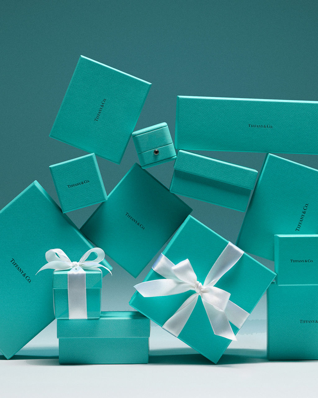
Tiffany & Co.: Make One Signature Color Ownable
Tiffany & Co. built a packaging color so distinctive that people recognize the brand from the box alone, no logo required. That’s the power of consistent, exclusive use.
The lesson: a signature color becomes more powerful the more consistently you apply it, across every box and every customer touchpoint. A recognizable brand color isn’t chosen once. It’s protected and repeated.
Cartier: Use Color to Signal Heritage and Presence
Cartier pairs a bold, saturated color with restrained detailing to create a strong visual presence. The color does the talking, and the design gets out of its way.
Material, typography, logo treatment, and finishing all affect the overall impression a color creates. A strong color choice can be undercut by cluttered design, and a simple color can carry a premium impression when everything else stays disciplined.

Bvlgari: Build a Color System, Not Just One Color
Bvlgari doesn’t rely on a single box color. It uses a coordinated palette that stays complementary and controlled across formats, from boxes to bags to display materials. The result is branded jewelry packaging that reads as one system, not a set of unrelated pieces.
The lesson: a color system, not one isolated color, gives a brand more flexibility while still reading as one coherent identity. This matters if you sell across multiple product lines or price tiers.

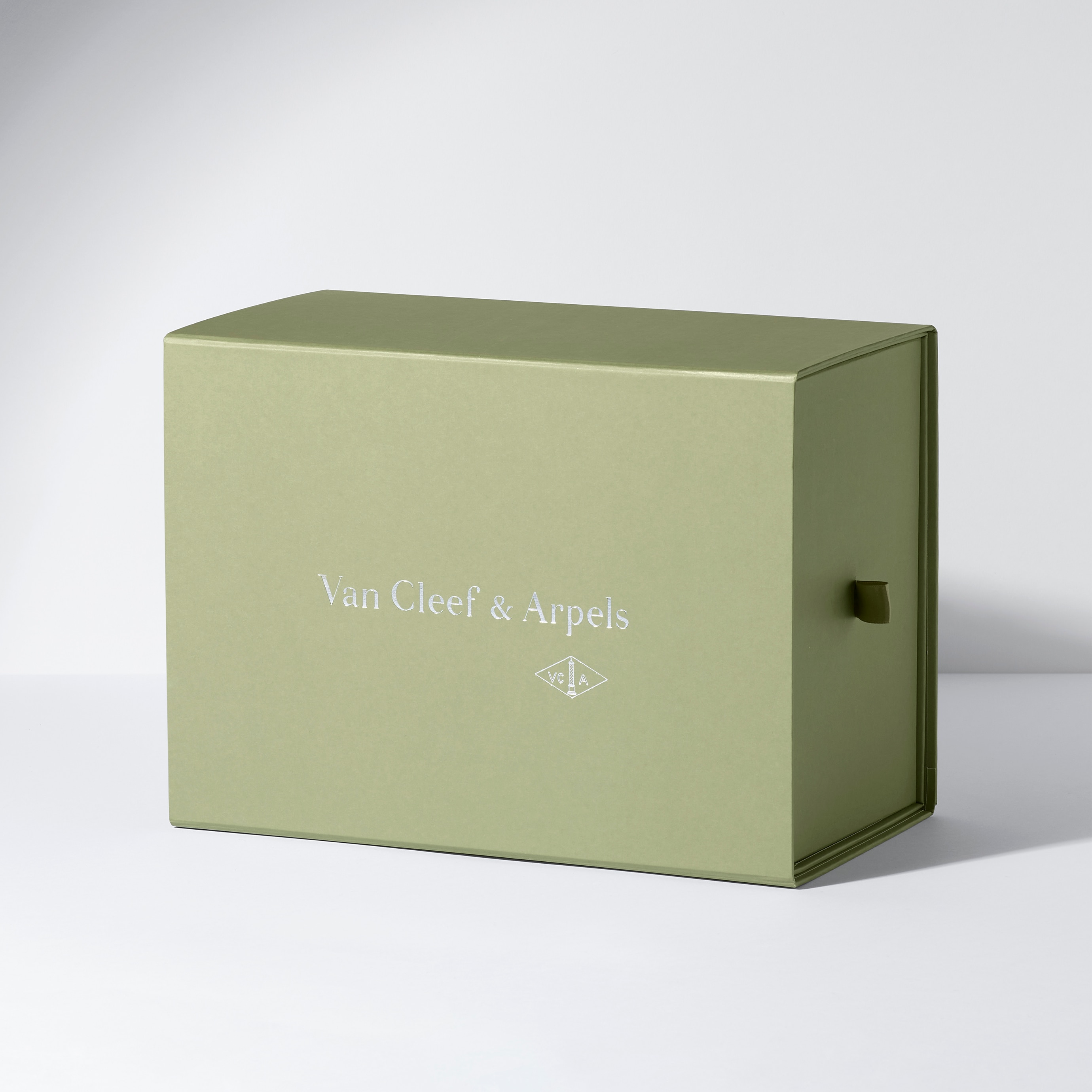
Van Cleef & Arpels: Let Material and Color Work Together
The same color family looks and feels different depending on the surface. Velvet, suede/microfiber, PU, and fabric are among the common jewelry packaging materials that shift how a color reads to the eye and hand, and each one changes how the same base color performs.
Screen colors are a starting point, not the final word. Evaluate your brand color on the actual materials your buyers will handle, not just on a digital swatch.
The Bigger Lesson: Don’t Copy a Luxury Brand — Build Your Own Color Identity
These brands give you strategic principles to learn from, not palettes to reproduce. Copying Tiffany blue or Cartier red won’t build your brand. It borrows someone else’s.
What actually creates a distinctive packaging identity:
- Consistency across every box, bag, and customer touchpoint
- Contrast that makes your product and branding stand out
- Simplicity that avoids competing colors or cluttered design
- Recognition built through repeated, deliberate use over time
- Customization that fits your specific brand, not someone else’s
If you’re weighing whether a fully custom color system is worth it over a stock option, the choice between custom jewelry boxes vs stock boxes usually comes down to how much control you need over color and material versus upfront cost.
How to Choose a Packaging Color for Your Jewelry Brand
Choosing a packaging color isn’t a design exercise. It’s a decision that should follow from your brand, your product, and your buyer. The jewelry packaging color ideas below give you a starting framework, not a fixed formula.
Start With Your Brand Positioning
Your packaging color should match your brand positioning before it matches your taste. Use these packaging color ideas as a starting point, then compare how different color families support different positions:
| Color Direction | Positioning Signal |
| Neutrals (ivory, taupe, grey) | Understated, premium, versatile |
| Dark tones (black, deep navy) | Bold, modern, high-contrast luxury |
| Soft pastels | Approachable, gift-led, bridal |
| Saturated signature colors | Distinctive, brand-first, memorable |
| Natural tones (wood, kraft, earth) | Sustainable, artisanal, warm |
| Metallic accents | Formal, high-value, statement |
Prioritize long-term brand consistency over short-lived color trends. Research on luxury branding backs this up: a study published in the Journal of Consumer Research found that lower-saturation colors tend to read as more established and higher status, since desaturated tones signal continuity and heritage to buyers. A color that fits your positioning holds up longer than one chosen for trend appeal alone.
Consider the Jewelry Inside the Packaging
The jewelry category you sell should inform your packaging color, not fight against it. Getting this wrong is one of the most common branded jewelry packaging mistakes brands make when they choose color before product.
- Gold and warm-tone pieces often pair well with neutral or dark backgrounds that let the metal stand out
- Gemstones need packaging that doesn’t compete with or distort their color
- Pearls and bridal jewelry tend to suit softer, lighter palettes
- Fashion jewelry has more room for bold or seasonal color choices
There’s no single best background color for every jewelry type. The right choice for your jewelry packaging set depends on contrast, product presentation, and the impression you want a buyer to form in the first few seconds.
Think Beyond the Jewelry Box
Your chosen palette should translate across every format a customer touches, not just the primary box. Think of it as one jewelry packaging set, not a collection of unrelated items: boxes, pouches, shopping bags, ribbons and inserts, display trays and stands.
A color that works on a rigid box can fail on fabric or fall flat on a paper bag. Test the palette across formats before you commit to full production. That consistency is what lets you create a cohesive jewelry unboxing experience rather than a mismatched one.
How Materials and Finishes Change the Way a Color Looks
A Pantone reference is only a starting point. Paper texture, velvet, suede/microfiber, PU, fabric, printing, and lamination all affect how saturated, deep, warm, or reflective a color actually looks once it’s produced. See jewelry box materials and finishing options for a full breakdown of how each material takes color and finish.
Matte vs Glossy Surfaces
Surface sheen changes saturation, reflection, contrast, and visual character, even when the underlying color specification is identical. Coating choice matters beyond aesthetics, too: a study in the Journal of Applied Packaging Research found that tactile coatings, soft-touch versus raised, embossed finishes, shifted buyers’ price sensitivity, even when the printed design underneath stayed the same. The same logic applies to matte and glossy jewelry packaging. Matte finishes tend to read as more premium and understated. Glossy finishes reflect more light and can look bolder or more commercial, depending on the color underneath.
Velvet, Suede, Fabric, and Textured Materials
Textured and textile materials make colors appear deeper, warmer, and more dimensional than smooth printed surfaces. Velvet in particular absorbs light in a way that shifts how saturated a color reads compared to a flat printed box in the same shade. The underlying mechanism shows up outside jewelry, too: a multisensory packaging study published in Scientific Reports found that tactile surface texture, raised versus smooth finishes, measurably shifted buyers’ willingness to pay, even in a food-packaging context. Touch changes perceived value before a buyer reads a word of copy, which may help explain why jewelry brands invest in velvet and suede over printed cardboard.
Foil, Embossing, and Logo Contrast
Foil colors, embossing, debossing, printing, and logo contrast all interact with the packaging’s base color. Consider:
- Readability of your logo against the base color
- Visual balance between the logo treatment and the surrounding surface
- Testing the physical combination, not just approving it on screen
A gold foil logo that looks striking in a mockup can disappear or clash once it’s pressed onto a specific material and color. Confirm color and material combinations with a physical sample before approving production.
Common Packaging Color Mistakes Jewelry Brands Should Avoid
A few recurring mistakes undermine otherwise strong packaging color decisions:
- Selecting colors only from a screen, without testing on the actual material
- Following short-lived color trends instead of building for longevity
- Using too many competing colors across one packaging system
- Ignoring how material changes color, saturation, and finish
- Weak or low-contrast logo placement against the base color
- Inconsistent colors across boxes, bags, pouches, and displays
- Approving production without a physical sample first
Most of these mistakes come down to one thing: treating color as a screen decision instead of a manufacturing decision. It’s one of the most common custom jewelry box ordering mistakes brands make when they skip that step.
From Color Concept to Production-Ready Packaging
Turning a color direction into manufactured packaging is a process, not a single decision. Working with a custom packaging manufacturer means the process runs through color references, material selection, structural design, finishing, jewelry packaging sampling, approval, production, and quality control. At ROMI, a 15-person engineering team reviews structural and color specs at each stage before anything reaches production. Learn more about custom jewelry box design and packaging engineering.
1. Define Your Color Direction
Establish your brand guidelines, reference colors, and Pantone targets where appropriate. Confirm desired materials, logo treatment, and positioning before development starts.
2. Develop Material and Finish Combinations
Evaluate candidate colors on the actual materials and structures under consideration. Treat color, texture, finish, logo treatment, and interior material as one coordinated packaging system, not separate decisions.
3. Produce and Review a Physical Sample
Inspect color, texture, structure, logo execution, and interior coordination on a real sample. Physical sampling matters more in jewelry packaging than almost any other category, because color accuracy and material appearance are central to the buyer’s first impression. Review ROMI’s jewelry packaging sampling process for typical MOQs and timelines.
4. Control Color Consistency During Production
Approved samples, documented material specifications, and in-line production checks maintain color and finish consistency across a full commercial run. Without this step, batch-to-batch color drift is common, especially across textured or dyed materials. See ROMI’s jewelry packaging quality control for how this is managed at scale.
3 Custom Jewelry Packaging Recommendations for Different Brand Color Strategies
Once you’ve settled on a color direction, the right packaging format depends on your strategy. Whether you need custom jewelry boxes, pouches, or full display sets, these are three jewelry packaging ideas: branded jewelry packaging formats ROMI Packing builds for brands at different stages, including custom logo jewelry boxes with premium branding options.
Product Recommendation 1: Custom Jewelry Box for a Signature Brand Color
Built for brands committing to one strong, ownable color across their packaging. It’s a custom jewelry box where exterior and interior color coordinate as one system, with customization available across size, interior lining, logo placement, foil stamping, and debossing where applicable. The result is a branded jewelry box that carries your color everywhere it goes.
This option suits brands ready to apply the Tiffany-style principle: one consistent color, repeated everywhere, protected over time. Explore the Forest Green Octagonal PU Leather Jewelry Box, an example of a bold, ownable signature color built into every surface.
Product Recommendation 2: Custom Jewelry Pouch for a Soft or Neutral Palette
Suited to understated, soft, or natural palettes where texture carries more of the brand impression than a bold color would. It’s a branded jewelry pouch available in velvet, suede/microfiber, or fabric, with drawstring and logo customization.
This format works well for bridal, pearl, and fine jewelry brands looking for a quieter, tactile presentation. View the Custom Velvet Jewelry Pouch & Jewelry Packaging Set.
Product Recommendation 3: Custom Jewelry Box & Display Set for a Coordinated Color System
For brands building a Bvlgari-style color system across retail and presentation, not just the primary box. This set coordinates boxes, trays, stands, and interior material as one visual system across your retail presence.
This is the strongest option if you sell across multiple price points or need packaging that performs both online and in-store. See the Grey Microfiber Display Set, Necklace Bust + Stands.
FAQ: Jewelry Packaging Color Selection
A quick jewelry packaging colors FAQ covering the questions that come up most before brands commit to a color and a set of jewelry packaging solutions.
What colors are best for jewelry packaging?
There’s no single best color. The right choice depends on your brand positioning, the jewelry category you sell, and the materials you’re using. Neutrals suit understated premium brands, while saturated signature colors suit brands built around strong recognition.
Can custom jewelry packaging be Pantone matched?
Yes. Pantone references give you a consistent target, though the final appearance still depends on the material. The same Pantone reference can look different on printed paper versus velvet or suede/microfiber.
Why does exterior and interior color look different on different materials?
Surface texture, sheen, and material type all affect how light reflects off a color. Matte, glossy, and textured surfaces reflect and absorb light differently, even with an identical color specification.
Should interior and exterior colors match?
Not always. Many brands use a contrasting or complementary interior color to create a moment of reveal when the box opens. What matters most is that the combination is intentional and tested, not accidental.
How many colors should a packaging system use?
Most strong systems use one dominant color plus one or two supporting or accent colors. More than that tends to dilute recognition rather than strengthen it.
Is custom jewelry packaging more expensive than stock packaging?
Usually, yes, at least upfront. Custom packaging carries its own minimum order quantity, typically starting around 500 to 1,000 pieces per box style depending on the design, versus buying stock boxes off the shelf. But the comparison isn’t just price per unit. Stock packaging can’t carry your color system, your logo placement, or your material choice, so the brand-recognition value custom packaging builds doesn’t show up in a stock option at any price. Talk to your manufacturer early about MOQ and sample costs. Many manufacturers, including ROMI, credit the sample cost back once you place a bulk order, so there are no surprises before you commit.
Turn Your Brand Colors Into a Production-Ready Packaging System
Choosing the right packaging color is only the first step. Turning that decision into consistent, manufactured packaging depends on the right materials, finishes, sampling process, and production controls working together. That’s the core of what a custom packaging manufacturer actually delivers.
ROMI Packing works as a manufacturing partner for jewelry brands translating a color direction into a coordinated packaging system, from custom OEM and ODM jewelry packaging manufacturing through sampling and production, backed by the full range of jewelry packaging solutions covered above. If you’re ready to move from color concept to production, discuss your requirements, develop a sample, or request a quotation.

